Showing posts with label Local Insights. Show all posts

Wednesday, October 25, 2017

Economic Hurdles in Rural Utah

by Mark Knold

Utah is a geographically large state. Based on total area, it is the 13th largest state, implying there is room to spread out. Despite all this space, Utah’s population distribution is quite concentrated. According to the U.S. Census Bureau, Utah is the nation’s 9th most urbanized state. This dichotomy has shaped a state with two economic profiles — one urban, one rural. It can be challenging for a state dominated and prospering within the urban to extend its economic bounty to the betterment of the rural.

What is rural? It depends upon one’s objective behind the question. Most define rural by a visual scan of the landscape. A lot of open land and not many people — rural. Yet economically, the view can be different. An area may look rural, but if the economic vitality of its populace is strongly integrated with a nearby urban area, then this creates a different perspective. The latter is a preference of the federal government — an entity that often makes allocation or distribution decisions based upon economic factors.


No matter how one technically defines rural, the Governor’s Office recognizes a recent dichotomy in Utah’s economic prosperity. Since the Great Recession, Utah has had compelling economic success. Yet, most of this is concentrated in Utah’s urban centers. Portions of Utah’s rural communities are not seeing matching levels of success. Utah’s Lt. Governor recently observed, “Not all of Utah’s communities are full participants in this economic success. Many counties off the Wasatch Front are experiencing challenges.”

In response to this economic disparity, the Governor’s Office has launched the 25k Jobs initiative — an effort for businesses to create 25,000 new jobs in 25 Utah counties by 2020. With this spotlight on rural Utah’s economics, let’s take a look at some of these rural challenges.

To most, jobs deliver their income and means for living sustenance. Therefore, employment, and peripheral variables associated with employment, becomes the strongest proxy for measuring the Utah economy’s health. We will look at Utah’s counties through the lens of employment, unemployment, the labor force and how the industry structure speaks to the underlying performance of these variables.

A profile of job growth becomes a starting point. Economic performance needs to be viewed with a somewhat long lens. The Governor’s 25k Jobs initiative was not born from a short-term disorder, but instead is recognition of weak longer-term fundamentals. To illustrate this perspective, one needs to backdrop the short-term mechanics against the longer-term dynamics.

The County Job Profile chart is an intersection of the short-term trend with the moderate-term. Each county is a bubble, and the bubble size reflects job counts. The chart is divided into four quadrants. The quadrants tell the story of the intersection of the short and moderate-term trends (growth or contraction) and the general health of the county’s economy.


There are two axes of measure. First, the vertical axis represents the short-term. It is the percentage of county job change between 2015 and 2016. Above the horizontal axis is growth — below is contraction.

Second, the horizontal axis measures the moderate-term. It is the percentage of job change over the past five years (2011-2016). To the right of the vertical axis is growth — to the left is contraction. Where a bubble lies is the intersection of the short and the moderate term.

To illustrate, find Beaver County on the chart. Beaver aligns with around -4.0 percent on the vertical axis, and 8.0 percent on the horizontal axis. This says that over the past five years, Beaver County’s job count has grown by 8.0 percent, but over the past year it has contracted by around 4.0 percent. This implies that Beaver County’s economy may be slipping a bit. A one-year view would imply a problem. A longer-term view places this short-term setback against a broader perspective of overall prosperity.

The quadrant of concern is the Contracting quadrant. These economies have contracted over both the most recent year and the past five years. No matter how one wants to define rural as outlined above, all of these contracting counties identify as rural.

In-county jobs alone are not the complete picture. For example, a large percentage of Morgan County’s residents commute to Weber or Davis counties for work. If jobs are not being germinated in Morgan County, the county and its population can still prosper from its ties with the urban area.

An additional way to look at the economy is through the lens of the labor force. The labor force consists of those 16-years and older who are either working or looking for work. It is based upon where people live, not where they work. A worker living in Morgan County will be represented in Morgan County on the following chart (County Labor Force Change); yet, if they work in Weber County, their job is represented in Weber County on the prior chart. Adding this perspective helps to round out a county’s profile.

The structure of the County Labor Force Change graphic is the same as the prior chart. The area of vibrancy is the upper-right quadrant where the labor force is increasing. The quadrant of labor force contraction is the lower left. A decline in the labor force occurs when people become discouraged and leave the labor force — yet stay in the county, or when people leave the county altogether. Either way, a decline in the labor force signals a fundamental negative in the economic trend.

Depending upon the variables measured, a gain in one and a decline in another can both be positive. Job growth and an unemployment decline are both positive. To associate the positive with low unemployment, the quadrant message on the Unemployment Rate chart has been transposed.

Every month an unemployment rate is calculated for Utah and each of its counties. A county’s unemployment rate can be measured against the Utah statewide average unemployment rate. In the following graphic, county rates are mathematically compared against the statewide rate (seasonally adjusted), recorded and then summed across time.

For example, if a county’s unemployment rate is 5.5 percent and the statewide rate is 4.0 percent, then that county’s difference for that month is 1.5. If a county’s rate were to be 3.5 percent against the statewide rate of 4.0 percent, then the difference is -0.5. These monthly differences are tallied and summed. A high score speaks to a consistent and persistent unemployment rate above the statewide average. In other words, these are counties with a continuous environment of high unemployment.

The horizontal axis is a measure since 2000 and the vertical axis a measure since the beginning of the Great Recession (2008). The axis intersection is not at zero to isolate the “concern area” within the upper right quadrant. The statewide average is consistently close to the Salt Lake County average, so a sizeable number of counties will have sums slightly above the statewide average; yet, this doesn’t imply an unemployment problem. But the non-zero intersection is utilized to emphasize the counties that do have an outstanding unemployment disparity.

Across these various charts, a common group of rural counties emerge in the weak quadrant. These include Carbon, Emery, Garfield, Piute and San Juan counties; with Duchesne and Uintah hanging on the edge. There is a common theme that surrounds this grouping and it centers upon low economic diversity.

An economy’s ability to be consistently positive has a strong foundation in a diverse mix of industrial employment. Think of it in terms of “not putting all your eggs in one basket.” Economic diversity is spreading jobs across many baskets. Diversity is desirable because the overall economy is not dominantly influenced by one or a handful of industries whose poor performance weighs upon the whole.

A Hachman Index is an evaluation tool measuring to what degree an economy may or may not have all its eggs in one basket. In the Hachman Index, a measure of 1.0 means your eggs are well distributed across many industries. Conversely, numbers approaching zero point to a high concentration in one or a handful of industries.


Many of the counties that score low on the previous charts are the same ones on the lowest tier of the following Hachman Index chart. This chart represents the placement of economic diversity upon employment change of the past five years. A county will be placed high or low (vertical axis) on the chart depending upon its Hachman Index score. It will align right or left (horizontal axis) depending upon its five-year employment change. Metropolitan counties have higher economic diversity than rural counties — placing them higher on the chart. They are also further to the right on the chart, showing stronger employment growth. There can be individual exceptions, but the general theme is that lack of economic diversity is a foundational impediment to economic viability. Industrial diversity, though difficult to artificially induce, is a desired remedy to counter sluggish economic performance.

Lack of diversity does not mandate a poor economy. A reproduction of this chart five years ago would have placed Uintah and Duchesne counties still low on the chart, but their five-year growth rates would have been off the chart, needing arrows to point out beyond the chosen 40 percent horizontal axis limit.

Those economies are dominated by energy production. When energy prices are high, their economies can soar. When energy falters, they often do likewise. They are striking examples of economic outcome being determined by a dominant industry.

In summary, there is a dichotomy within the Utah economy between urban and rural. The urban economies are diverse and, therefore, more economically balanced; while many rural economies are not. With some rural counties the economic distinction is not a wide divide; but in the rural counties where the divide is pronounced, the underlying theme is often a low level of economic performance.

Tuesday, February 14, 2017

Better, Faster, Smarter... Check out our new website design!


Go to: JOBS.UTAH.GOV/WI to check it out

Information is the treasure of the current age. The instant access to information since the advent of the Internet has transformed societies in ways that thousands of years prior had not. Information can lead to knowledge, and — with increased knowledge — better efficiencies and way of life. If information is vital, then the presentation of information has also risen to a prominent level. With this, the Utah Department of Workforce Services has made some organizational improvements to its economic webpages. Various economic data categories are not mutually exclusive, but we made an effort to compartmentalize economic data for a better organizational display and navigation. We also added a new feature area that taps into various national data elements and measurements from the Federal Reserve Economic Data (FRED), the database of the Federal Reserve Bank of St. Louis. FRED’s added value is national — and Utah — economic indicators. More on FRED’s contribution below.

Depending on the subject, economic data can be categorized as either broad or specific. For example, the demographic makeup of an area and how that impacts an economic structure is a broad-subject approach. Conversely, a current monthly snapshot of the Utah economy, its job growth and unemployment rate is a more specific observation. Our economic webpage has four “portals” through which to “categorize” and search for information. One portal is broad, while the other three are more specific in nature.

Topic Portals

The monthly employment profile just mentioned is a specific topic and gets its own “portal,” entitled Employment Update. Here, the most current Utah economic performance can be explored and summarized. The information found here is what often gets cited in the local news media in reference to the current Utah job performance and unemployment rate.

The second specific “portal” is labeled Local Insights. This is a quarterly profile of the Utah economy down to a county level. Each county is summarized with its own economic performance, including job growth, unemployment rate, housing starts, taxable sales and other profile variables. The common theme here is a county-specific approach.

The third specific “portal” is Reports and Analysis. Workforce Services’ economic forte is the labor market. Things over and above the everyday reporting on the labor market are presented here. Sometimes we do special economic studies, other times we will report on specific economic groups within the labor force, like women or veterans. Anything we do that is not an often repeated or ongoing report are grouped here.

The final “portal,” and possibly the one that will be most used, is labeled Economic Data. The core of our data collection and analysis is concentrated here. Employment data, occupational data, wage information and demographic profiles are just some of the major economic themes found in this area.

FRED's on site

As mentioned earlier, we have added an economic indicator area tapping into FRED, which is a massive compilation of economic data from various sources — primarily government statistical agencies, but also some nongovernmental organizations. Workforce Services economists have gone through the list and selected a handful of the most useful data series for gauging the performance of Utah’s macro economy and gaining insights into expected trends. Utah functions within the national economy, so the national economic indicators profiled here are intended to also be guiding influences on the Utah economy. These indicators include composite indexes; a recession probability indicator; leading indicators, such as construction permits and the yield curve; coincident indicators, such as real GDP and employment; and price indicators, such as the consumer price index, regional housing prices, and oil and gas prices. Each chart has a detailed description of what the data represent and how they may be useful.

Keeping relevant with the fast-changing pace of the Internet and data presentation is our goal at Workforce Services. We hope these changes help to better present our broad package of economic data offerings.

Wednesday, October 19, 2016

Show Me the Economy

Mark Knold, Supervising Economist 

“The government knows everything about everyone.”

 Fortunately, that statement is not true. Yet society still looks to the government to provide answers to comprehensive and complex questions that have their foundation within individual decisions and activities. One subject frequently directed toward the government is individual-level information about the economy — particularly, what occupations are in demand, what occupations pay well and have lucrative outlooks, and ultimately, what occupation(s) should I build my career upon?

It takes the accumulation of a wide array of individual information to answer these questions. Employers provide the foundation information about the occupations they employ. Jobs are held by individuals, but employers provide the profile information about the job itself, not any particular individual.

Since society desires to profile such a broad spectrum of the economy — occupational profiles and the occupational distribution within the economy — only government is in the unique position to collect, analyze and provide answers for said desire. Yet, no government program or regulatory agency mandates any comprehensive occupational reporting from individuals or businesses. Therefore, government attempts to fill the void with an ongoing, robust and voluntary survey of employers — a survey where employers are asked to provide details about their various occupations; including descriptions, quantities, wages/salaries and location. Through this survey emerges an occupational portrait of an economy.

The U.S. Bureau of Labor Statistics (BLS) structures and funds the survey, yet the individual states conduct the survey. Under BLS administration, all states use the same methodology; therefore, occupational profiles are comparable across states.

Through this survey, analysts discover how industries are populated with various occupations. Accountant is an occupation, yet accountants can be found across many different industries. Other occupations may be more exclusive to certain industries; for example, doctors are largely found only in the healthcare industry. One of the survey’s products is that industries can be profiled with their general mix of occupations. This is called an industry’s occupational staffing pattern.

This brings us back to the original questions: what occupations are in demand, what occupations pay well and have lucrative outlooks, and ultimately, what occupation(s) should I build my career upon? The foundation is to make informed forecasts about how industries will expand/contract over the next 10 years. By applying existing occupational staffing patterns to each industry’s projected change, a trained economic analyst can then make an extrapolation about how occupations will correspondingly increase/decrease. Knowledgeable analyst judgment further refines the occupational expectations, such as knowing an occupation will grow faster than in the past, with the result being a set of occupational projections that accumulate to profile a state or regional economy.

A new set of occupational projections are done every two years to keep the information fresh even though economies do not change dramatically in short order. Because of slow change, updated occupational projects generally continue the overall message of preceding occupational projections. But economies do modify with time, and therefore, subtle changes will arise with each new set of occupational projections.

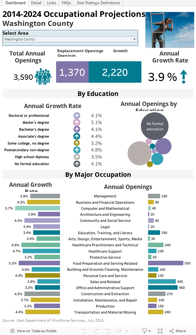
Utah’s most recent occupational projections are found here: http://www.jobs.utah.gov/wi/pubs/outlooks/state/index.html. These projections look forward to the year 2024.

The occupational profile is structured from the general to the detailed, mimicking the structure of a family tree. First, broad occupational categories are defined, such as management or healthcare occupations; then, subcategories are defined; and finally, individual occupations are defined. Individual occupations are the heart of the occupational projections. But overall patterns and characteristics do emerge when observing the broader categories.

While a Utah statewide profile leads the way, Utah’s local economies are not homogenous; therefore, nine Utah subregions are also profiled. Due to confidentiality restraints and statistical reliability, the amount of occupations available will diminish the smaller a subregion; but, occupations comprising the backbone of a regional economy will be available.

Eastern Region Highlights

Scott Smith, Regional Economist

The Eastern Region labor market is dominated by resource extraction industries. Roughly 15 percent of all 2014 jobs (the base year for the projections) are counted in the mining sector. A further 4 percent are involved in the short haul trucking industry — businesses that are almost exclusively hauling coal, oil and gas-related products. Alternately, a little more than half the jobs in the Eastern Region are located in the oil-rich Uintah Basin. Employment in Uintah and Duchesne counties is highly dependent on the price of oil and subject to the volatility of the commodity cycle. It is an understatement to note that the oil and gas industry is currently in a slump. In addition, Carbon and Emery counties both have a relatively large number of active coal mines, an industry facing its own challenges.

Given these headwinds, Eastern Region employment is projected to grow by only 0.8 percent annually through 2024. Total oil and gas employment is projected to grow at 0.1 percent annually. Coal mining employment is expected to decline by 1.3 percent annually. Construction, which is currently 6 percent of the total jobs, is naturally expected to follow this trend and is projected to increase by only 0.3 percent annually.

Table 1 shows the top six sectors in terms of new jobs. These 2,546 jobs comprise a little more than 60 percent of the projected Eastern Region total.


 With the exception of Junior Colleges and Restaurants and Eating Places, growth is expected to be sluggish.

Occupations related to the restaurant industry are expected to add the greatest number of net new jobs. Combined food preparation/serving workers and waiters/waitresses are expected to add more than 13 percent of net new jobs over the forecast horizon. The entry level salary for these jobs range from $16,888 to $17,010.
While cashiers are expected to add a substantial number of jobs annually, the total number of jobs is expected to shrink over the forecast horizon. The high number of annual openings is entirely a function of turnover. Entry level cashier jobs in the Eastern Region pay $17,220.

Heavy truck drivers are expected to add almost 5 percent of net new jobs. These jobs pay $39,400 to start and require some post-secondary education.

For occupations requiring at least a bachelor’s degree, the teaching occupations generate the largest number of net new positions. These jobs are projected to comprise 10 percent of all net new jobs. The vast number of these jobs are involved in primary or secondary education and start around the mid-$30,000.

Friday, January 29, 2016

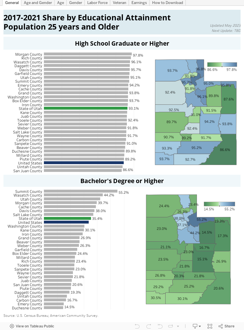
Educational Attainment and Castle Country

Scott Smith, Regional Economist


The American Community Survey (ACS) is a statistical survey administered by the U.S. Census Bureau. It regularly gathers information previously contained only in the long form of the decennial census, such as educational attainment, income and housing characteristics by age and sex. Sent to 3.54 million addresses annually, it is the largest survey (other than the decennial census) that the Census Bureau administers.

The ACS offers insights how the country’s workers of varying educational attainment are distributed and how they are compensated.

As a point of reference, on average, U.S. workers who possess less than a high school diploma earn $19,954. High school graduates earn $27,868. Workers who have earned an associate’s degree or attended college earn $33,988. College graduates earn $50,515. Recipients of graduate degrees earn $66,944.

Nationally, men make more than women. For example, women earn between 32 and 34 percent less than males with equivalent educational background. Some, but not all, of this difference can be explained by a significant proportion of women who choose part-time employment.

The ACS also maps the composition of the labor force by highest educational attainment. Nationally, roughly 12 percent of the 25-year-and-older population has not graduated from high school. Almost 27 percent of the population has a high school diploma while 31 percent has advanced to an associate’s degree or has attended university. A little more than 30 percent has a bachelor’s degree.
What follows is a comparison of the population of the counties in the Castle Country against the national statistics.

Carbon County

On average, Carbon County residents 25 years and older who possess less than a high school diploma earn $21,726. High school graduates earn $29,063. Workers who earned an associate’s degree or attended college earned $29,136. College graduates earn $37,986, while recipients of professional/graduate degrees make $54,704.

Carbon County workers earn 85 percent of the U.S. median. Sorting by gender yields the statistic that Carbon County women earn 43 percent of men’s wages, while the analogous U.S. figure is 72 percent. Women with less educational attainment influence this figure. Women with no high school degree earn 22 percent, 42 percent for high school graduates and 37 percent for associate’s degrees.
High school graduates in Carbon County earn 104 percent of the U.S. median for both sexes. Men earn 124 percent of the U.S. median for men, while women earn only 78 percent of their respective median. Carbon County residents who hold an associate’s degree or have attended college make 86 percent of the U.S. median. Men earn 122 percent of the U.S. median for men, while women earn 65 percent of the U.S. median for women. College graduates in Carbon County make 75 percent of the U.S. median for both sexes. Men earn 89 percent, while women earn 80 percent. Recipients of graduate degrees earn 82 percent of the U.S. median. Men make 87 percent of the median for men, while women make 91 percent their respective median.

Carbon County residents differ from the national profile by educational attainment. Almost 48 percent of the population hold an associate’s degree or have attended college. In contrast, only 31 percent of the U.S. population has the same level of attainment. Conversely, only 13 percent of the county labor force holds at least a bachelor’s degree. The analogous figure for the U.S. is 31 percent.

Emery County

Emery County residents who possess less than a high school diploma earn on average $18,068. High school graduates earn $31,123. Workers who earned an associate’s degree or attended college earn $32,891. College graduates earn $45,625, while recipients of professional/graduate degrees make $45,682.

In total, women earn 35 percent of men’s wages, while the analogous U.S. figure is 72 percent. Only women with graduate degrees approach the national median. Emery County women with no high school diploma earn 34 percent, 41 percent for high school graduates and 28 percent for women with associate’s degrees. Women with bachelor’s degrees earn 49 percent of the male counterparts’ income.

The effects of mining employment are apparent in the income by gender statistics. Emery County workers make 94 percent of the U.S. aggregate median. Workers with less than a high school education earn 91 percent of the aggregate median. Men earn a 123 percent of the U.S. median for men, while women earn 62 percent of the U.S. median for women. Emery County high school graduates earn 112 percent of the U.S. median for both sexes. Men earn 127 percent of the U.S. median for men, while women earn only 78 percent of their respective median. Emery County residents who hold an associate’s degree or have attended college make 97 percent of the U.S. median. Men earn 125 percent of the U.S. median for men, while women earn 50 percent of the U.S. median for women. College graduates in Emery County make 90 percent of the U.S. median for both sexes. Men earn 92 percent, while women earn 65 percent. Recipients of graduate degrees earn 68 percent of the U.S. median. Men make 73 percent of the median for men while women make 72 percent their respective median.

Emery County residents differ from the national profile by educational attainment. Almost 48 percent of the population hold an associate’s degree or have attended college. In contrast, only 31 percent of the U.S. population has the same level of attainment. Conversely, only 11 percent of the county labor force holds at least a bachelor’s degree. The analogous figure for the U.S. is 31 percent.


Wednesday, November 4, 2015

Reviewing the 2012 Agricultural Census for Castle Country

<

Scott Smith, Regional Economist

The 2012 Census of Agriculture is just that — a census. It is an attempt to count an entire population and generally does not use sampling or statistical techniques to make conclusions. It is conducted every five years and includes all farm operators regardless of whether farming is their primary or secondary occupation. Operators and hired laborers are combined for a total count. There can be a maximum of three operators per farm, but labor hired on a contract basis is not covered.

Castle Country agriculture is focused on the production of livestock and associated feedstock. Almost 90 percent of Carbon County agricultural land is classified as pasture and rangeland. Emery County is a bit different. It is just over 50 percent pasture and rangeland, and 26 percent cropland. The remainder is woodland and other. 2012 net cash income per farm for the two counties was $1.4 million and $140,000 respectively. The bulk of the region’s farms have total annual sales of less than $250,000.

Castle Country farm employment in the 2012 census was 1,944. As noted above, the census counts workers whose primary and secondary source of income is agriculture. Additional data sources reveal that the vast majority of the Castle Country farm workforce has primary jobs outside of agriculture. The size and composition of the agricultural workforce has changed markedly over time. In 2002, the total labor force was 1,732 of which 37 percent was hired labor. The total agricultural workforce increased by 11 percent by 2007 to 1,914, but the number of hired laborers actually declined to 29 percent. The analogous figures for 2012 are 2 percent and 24 percent.

There is an obvious trend away from hired employment. The reason for this can be gleaned from expense data. In 2002, the labor cost per worker (as defined by dividing annual labor expense by the hired workforce) was $2,690. In 2007, the cost had risen 27 percent to $3,320. In 2012, this number had increased by 21 percent to $4,140. In contrast, inflation increased by 15 percent and 9 percent respectively, as of the 2007 and 2012 censuses. Faced with higher real (inflation adjusted) labor costs, operators appear to have substituted to their own labor or made investments in capital goods.

The number and character of Castle Country operators has displayed an interesting combination of volatility and adherence to the trend. There were 724 principal operators in the Castle Country in 2002 (the statistics refer to “principal” operator and therefore will not agree with other totals). The number of operators increased by 23 percent to 887 operators in 2007, and then remained essentially unchanged as of the 2012 count. Similarly, in 2007, the proportion of operators who rely on other sources of income shot up to 68 percent from 55 percent in 2002. The share returned to 55 percent in the 2012 census.

Analysts speculate that the changes are in response to fluctuations in farm income. In 2002, net cash income per operator was $2,887. Operators suffered a loss of $484 in 2007, and generated a gain of only $345 in 2012. Farming takes some capital investment, and the proprietorship of an ongoing enterprise is somewhat “sticky” — operators are loath to walk away from their investments. Presumably, the large gains generated in 2002 attracted market participants who stayed around to experience a loss in 2007. That loss and the rather meager gain generated in 2012 were insufficient to attract any more participants into the industry. Similarly, the losses generated in 2007 made it necessary for some operators to seek other sources of income. The small gain of 2012 was sufficient to reduce the share of “full time” operators back to its historic norm.